
- - Why texture and color contrast matter in planting design
- - Understanding plant texture and how to combine it
- - Using color contrast to create visual impact
- - Real garden story: transforming a flat landscape
- - How to design a balanced and lasting planting layout
1. Why Texture and Color Contrast Matter in Planting Design
Learning how to use texture & color contrast in planting is one of the most effective ways to elevate a garden from ordinary to visually striking. Many gardens fail not because of poor plant choices, but because everything blends together without contrast.
1.1 Texture creates depth. When plants with different leaf sizes, shapes, and structures are combined, the garden feels layered and dynamic rather than flat.
1.2 Color contrast guides the eye. Strategic use of contrasting hues helps highlight focal points and creates natural movement throughout the space.
1.3 Together, texture and color work as design tools. They help define areas, create balance, and bring personality to outdoor spaces—whether it’s a small backyard or a large landscape.

2. Understanding Plant Texture and How to Combine It
Before applying contrast, it’s essential to understand what “texture” means in planting. It refers to how a plant looks visually, not how it feels physically.
2.1 Fine texture: Plants with small, delicate leaves—like ferns or ornamental grasses—create a soft, airy effect.
2.2 Medium texture: Most common garden plants fall into this category, providing a neutral base for design.
2.3 Coarse texture: Large, bold leaves—such as hostas or tropical plants—draw attention and act as focal points.
2.4 The key to mastering how to use texture & color contrast in planting is combining these textures thoughtfully. For example, placing fine-textured plants next to coarse ones creates immediate visual interest.
2.5 A practical approach:
1. Start with a dominant texture to anchor the design.
2. Add contrasting textures to create variation.
3. Repeat patterns to maintain cohesion rather than chaos.

3. Using Color Contrast to Create Visual Impact
Color is often the first thing people notice in a garden, but using it effectively requires more than just picking favorite shades.
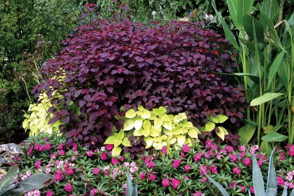
3.1 Complementary colors: Pairing opposite colors on the color wheel—like purple and yellow—creates bold, energetic contrasts.
3.2 Analogous colors: Using colors next to each other—such as blue and green—produces a more calming, harmonious effect.
3.3 Light vs. dark contrast: Even within the same color family, combining light and dark tones adds depth and dimension.
3.4 Seasonal awareness matters. A garden should evolve throughout the year, so choosing plants with different bloom times ensures ongoing visual interest.
3.5 Platforms like Beautiful Landscapes often highlight how successful designs use both bold contrasts and subtle transitions to keep gardens visually engaging without overwhelming the viewer.
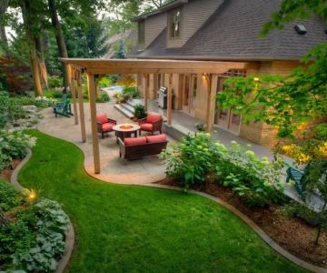
4. Real Garden Story: Transforming a Flat Landscape
A homeowner once struggled with a backyard that looked “green but boring.” Despite healthy plants, the space lacked character.
4.1 The original layout used plants of similar height, texture, and color. Everything blended into a single, uniform layer.
4.2 The redesign focused on contrast:
1. Tall ornamental grasses were added behind broad-leaf plants.
2. Deep green foliage was paired with silver-toned plants.
3. Bright seasonal flowers were introduced as accents rather than the main feature.
4.3 Within months, the garden felt completely different. It had depth, movement, and clear focal points.
4.4 This transformation showed that the issue wasn’t the plants—it was the lack of intentional contrast.
5. How to Design a Balanced and Lasting Planting Layout
Applying how to use texture & color contrast in planting successfully requires balance. Too much contrast can feel chaotic, while too little can feel dull.
5.1 Create focal points: Use bold textures or colors sparingly to draw attention where you want it.
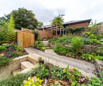
5.2 Layer your planting: Arrange plants in tiers—tall in the back, medium in the middle, and low in the front—to enhance both texture and visibility.
5.3 Repeat key elements: Repetition helps unify the design and prevents it from feeling random.
5.4 Consider maintenance: Choose plants that not only look good together but also thrive under similar conditions.
5.5 Adapt over time: Gardens are living spaces. Observing how plants grow and interact allows you to refine the design season after season.
When done thoughtfully, combining texture and color contrast turns any planting area into a visually rich and inviting space—one that feels both intentional and effortlessly beautiful.


 Brown Enterprises Landscaping4.0 (10 reviews)
 Cory's Landscaping and Design, LLC1.0 (1 reviews)
 Coulee Region Landscape & Design LLC5.0 (8 reviews)
 Amelon Lawn Care LLC5.0 (3 reviews)
 Ewing Landscape LLC3.0 (2 reviews)
 Madison Green Team4.0 (26 reviews)
 How to Shield Plants From Strong Winds in Your Yard
 How to Choose Outdoor Furniture That Complements Landscape
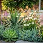 How to Reduce Maintenance with Smart Plant Grouping
 How to Plan a Garden for Succession Blooming
 How to Plan an Entryway Garden That Welcomes Guests
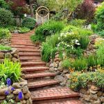 How to Build Garden Steps That Look Natural